How to Create a Responsive 3 Column Layout Flexbox CSS

A 3-column layout helps you to organize and present your website’s content more effectively.
You can use it to display different sections, such as featured services, product listings, pricing cards, or articles list, in a structured and visually appealing manner. Flexbox offers flexibility and control, providing powerful tools for aligning the columns, and ensuring responsive behavior across various devices.
Simple Three Columns Layout Flexbox
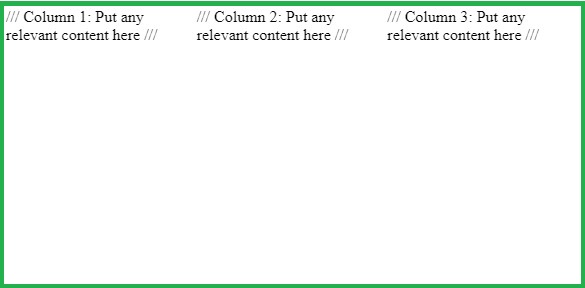
Start by creating a container with the class columns-3. Add your 3 columns inside the container.
HTML code
<h2>Simple 3 Columns Layout Flexbox</h2>
<div class="columns-3">
    <div class="bg-red">/// Column 1: Put any relevant content here ///</div>
    <div class="bg-pink">/// Column 2: Put any relevant content here ///</div>
    <div class="bg-orange">/// Column 3: Put any relevant content here ///</div>
</div>
Then, set the columns’ container width to 100% using CSS. Also, apply flexbox to the container using display: flex.
CSS code
/* container */
.columns-3 {
    width: 100%;
    display:flex;
}
Use the .columns-3 > * selector that targets the direct child elements of .columns-3, which are the individual columns.
Set the width of each column as one-third of the container’s width using width: calc(100% / 3);. This value ensures that each column occupies one-third of the container’s width, resulting in equal width distribution among the columns. Alternatively, you can use width: 33.33%;.
/* columns */
.columns-3 > * {
    width: calc(100% / 3);
}
/* Optional */
.bg-red {
  background-color: red;
}
.bg-pink {
    background-color: pink;
}
.bg-orange {
    background-color: orange;
}
Full CSS Code
/* container */
.columns-3 {
    width: 100%;
    display:flex;
}
/* columns */
.columns-3 > * {
    width: calc(100% / 3);
}
/* Optional */
.bg-red {
  background-color: red;
}
.bg-pink {
    background-color: pink;
}
.bg-orange {
    background-color: orange;
}
Result
Responsive 3 Column Layout Flexbox
You can make the 3 column layout responsive by colapsing the 3 columns into one column smaller screens and devices. Media queries are the best choice for adding responsiveness.
Let’s use some media queries to make the 3 column layout responsive.
- Set the
flex-wrap: wrap;property to the container. This property allows the columns to wrap to the next line if they exceed the container’s width. This ensures that the layout remains visually pleasing on smaller screens where the available width is limited.
/*Adding Responsiveness*/
.columns-3 {
    width: 100%;
    display: flex;
    flex-wrap: wrap;
}
- sets the width of the columns to occupy the full width of the container.
/* Full width on smaller screens */
.columns-3 > * {
    width: 100%;
}
- Use media query to target screens with a minimum width of 992 pixels, typically larger screens like tablets, laptops, and desktops and set the width to one-third.
@media (min-width: 992px) {
 .columns-3 > * {
     width:calc(100% / 3);
  }
}
Browser support for 3 columns CSS Flexbox
- flex: Supported by 99% the web browsers
- calc: Supported by 98% the web browsers
Examples Of 3 Column Layouts Using Flexbox
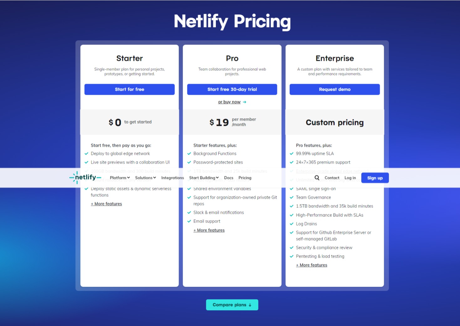
1. Pricing Cards
2. Product Listing

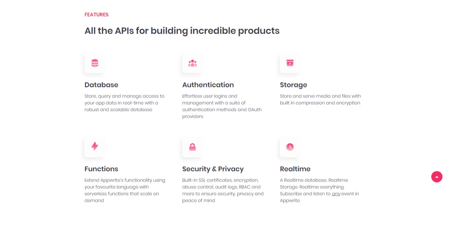
3. Product Features