Basic HTML Layout: Create a One Column Layout in HTML and CSS
A good website layout has readable and well organized content. You can create a good website layout by combining the strengths of two languages: HTML and CSS. HTML provides the containers that hold the content. CSS dictates the position, size, color, background and alignment of the containers.
Basic HTML Layout using HTML5 semantic tags

With the introduction of HTML5, you can easily divide website’s content into relevant sections.
This helps, search engines, screen readers to clearly understand the structure of your website content. This in turn helps them to place importance of text on a webpage and skip content that may be unrelated to the usefulness of that page.
Code
<nav class="nav">
  ///////// Navigation link  ////
</nav>
<article class="main-content">
 /////// Content //////
</article>
<footer class="footer">
  ///// Footer links and copyright notice /////
</footer>
Basic HTML Layout using HTML div tags
Code
<div class="nav">
  ///////// Navigation link  ////
</div>
<div class="main-content">
 /////// Content //////
</div>
<div class="footer">
  ///// Footer links and copyright notice /////
</div>
HTML Structure
<section class="container">
 <div class="content"><div>
</div>
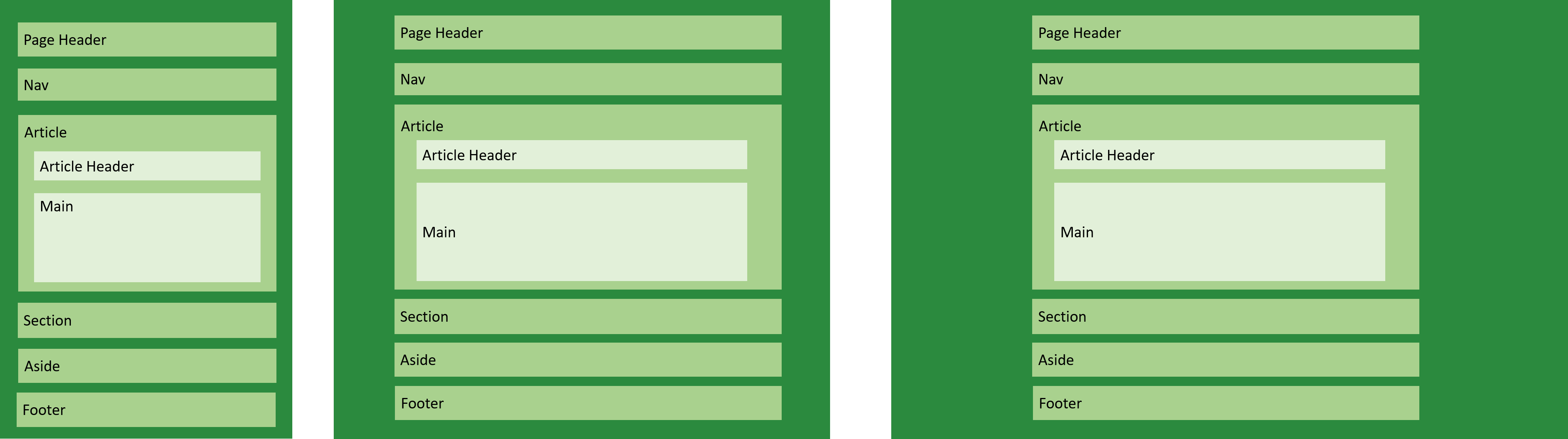
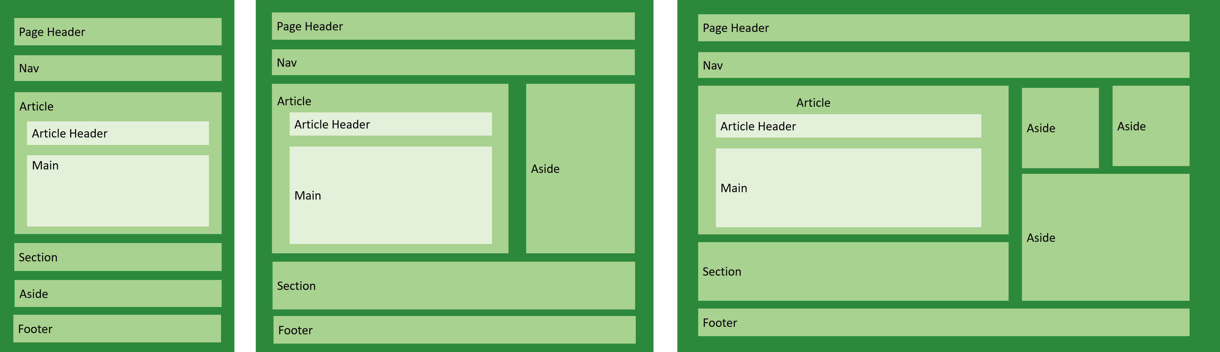
Elements of a basic HTML layout
Page Header
Contains website name or logo.
Nav
Contains links to the most important parts of the website.
Article
Contains content specific to one particular webpage. It has a header element and a main element.
Article Header
It may contain the article heading, author’s name, publishing date and logo. You can have an article header or a page header.
Main
Contains the main content that brought the reader to that page. Each web page can only have one <main> element.
Section
Contains free standing content that does not qualify to be an article.
Aside
Footer
Usually contains additional links like privacy, about, … and copyright notice.
Boxed HTML layout with CSS
Content exist within a set boundary on the website. This is achieved by setting the maximum width of the website.
This creates a single centered column with fixed-width on desktop and wide screen. With responsive design practices, the website is allowed to resize content according to smaller screen. However, with wider screen beyond the set maximum width, the website no longer expands the content.
Code
<section class="section">
  <div class="container">
    Blah Blah Blah
  <div>
</div>
.section {
  padding-left:2em;
  padding-right:2em;
}
.container {
    max-width: 1000px;
    margin-left: auto;
    margin-right: auto;
}
Full width HTML layout with CSS
The website content covers the whole width of the content. This layout maximizes the space available on each device. On mobile, content is displayed as one column but on desktop and wide screen, more columns are introduced.
Important content is given more space while less important content is allocated limited space.
Code
header, footer, main {
    padding-left: 2em;
    padding-right: 2em;
}

@media (min-width: 48em){
  header, footer, main {
    padding-left: 3em;
    padding-right: 3em;
   }
 }
