How to Create Sticky Footer in Bootstrap 4 and 5
You can stick the footer to the bottom of the screen(viewport) with both Bootstrap 4 and 5.
But what exactly is a sticky footer?
A sticky footer “sticks” to the bottom of the viewport in cases where the content is shorter than the viewport height. If the content of the page extends past the viewport bottom, the footer then sits below the content as normal. MDN Web Docs
A sticky footer should not be confused with fixed footer that is always visible(fixed) on the screen regardless of content length.
You can also use custom CSS to make a sticky footer for your website.
1. Bootstrap 5 Footer Fixed Bottom
Add Bootstrap 5 to Your Website
Start by adding Bootstrap 5 to your website.
Include the CSS in the head and Javascript in the body section just before the closing body tag.
<!DOCTYPE html>
<html>
  <head>
    <meta charset="utf-8">
    <meta name="viewport" content="width=device-width, initial-scale=1">
    <!-- CDN Booststrap CSS -->
    <link href="https://cdn.jsdelivr.net/npm/bootstrap@5.1.3/dist/css/bootstrap.min.css" rel="stylesheet" integrity="sha384-1BmE4kWBq78iYhFldvKuhfTAU6auU8tT94WrHftjDbrCEXSU1oBoqyl2QvZ6jIW3" crossorigin="anonymous">
  </head>
  <body>

  </body>
</html>
Add Normal Footer to Website
<body>
  <footer class="footer mt-auto py-3 bg-dark">
    <div class="container">
      <span class="text-light">Place sticky footer content here.</span>
    </div>
  </footer>
</body>
Result
Make Footer Sticky
To make your footer stick to the bottom of the viewport, add classes d-flex, flex-column, and h-100 to the body tag.
Also add class h-100 to <html> tag.
Bootstrap 5 Sticky Footer Code
<html class="h-100">
  <head>
    <meta charset="utf-8">
    <meta name="viewport" content="width=device-width, initial-scale=1">
    <link href="https://cdn.jsdelivr.net/npm/bootstrap@5.1.3/dist/css/bootstrap.min.css" rel="stylesheet" integrity="sha384-1BmE4kWBq78iYhFldvKuhfTAU6auU8tT94WrHftjDbrCEXSU1oBoqyl2QvZ6jIW3" crossorigin="anonymous">
  </head>
  <body class="d-flex flex-column h-100">
    <footer class="footer mt-auto py-3 bg-dark">
      <div class="container">
        <span class="text-light">Place sticky footer content here.</span>
      </div>
    </footer>
  </body>
</html>
Result
2. Bootstrap 4 Sticky Footer
Don’t worrry if you are still using Bootstrap 4. You can still make a sticky navbar using the 4th version of Boostrap.
1. Add Bootstrap 4 to Your Website
Add the Bootstrap’s CSS code in the head section and Javascript code in the body section.
<head>
  <meta charset="utf-8">
  <meta name="viewport" content="width=device-width">
  <link rel="stylesheet" href="https://cdn.jsdelivr.net/npm/bootstrap@4.6.1/dist/css/bootstrap.min.css" integrity="sha384-zCbKRCUGaJDkqS1kPbPd7TveP5iyJE0EjAuZQTgFLD2ylzuqKfdKlfG/eSrtxUkn" crossorigin="anonymous">
  <link href="style.css" rel="stylesheet" type="text/css" />
</head>
<body>

</body>
Add Normal Footer to Webpage
Add your footer code. In this case, your footer code is:
<body>
  <footer class="footer mt-auto py-3 bg-light">
    <div class="container">
      <span class="text-muted">Place sticky footer content here.</span>
    </div>
  </footer>
</body>
Make footer sticky
To make your footer stick to the bottom of the viewport, add the following CSS code to your CSS file.
html {
  position: relative;
  min-height: 100%;
}
body {
  margin-bottom: 60px; /* Margin bottom by footer height */
}
.footer {
  position: absolute;
  bottom: 0;
  width: 100%;
  height: 60px; /* Set the fixed height of the footer here */
  line-height: 60px; /* Vertically center the text there */
}
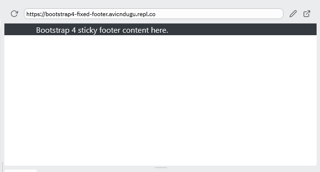
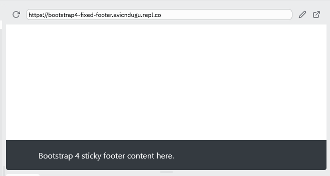
Bootstrap 4 Sticky Footer Code[Complete]
HTML Code
<head>
  <meta charset="utf-8">
  <meta name="viewport" content="width=device-width">
  <link rel="stylesheet" href="https://cdn.jsdelivr.net/npm/bootstrap@4.6.1/dist/css/bootstrap.min.css" integrity="sha384-zCbKRCUGaJDkqS1kPbPd7TveP5iyJE0EjAuZQTgFLD2ylzuqKfdKlfG/eSrtxUkn" crossorigin="anonymous">
  <link href="style.css" rel="stylesheet" type="text/css" />
</head>
<body>
  <footer class="footer bg-dark">
    <div class="container">
      <span class="text-light">Bootstrap 4 sticky footer content here.</span>
    </div>
  </footer>
</body>
CSS Code
html {
  position: relative;
  min-height: 100%;
}
body {
  margin-bottom: 60px; /* Margin bottom by footer height */
}
.footer {
  position: absolute;
  bottom: 0;
  width: 100%;
  height: 60px; /* Set the fixed height of the footer here */
  line-height: 60px; /* Vertically center the text there */
}
Result
The footer will be pushed down if you add content longer than the screen height.
3. Bootstrap Fixed Footer
Bootstrap 5 Fixed Footer Example
<head>
  <meta charset="utf-8">
  <meta name="viewport" content="width=device-width, initial-scale=1">
  <link href="https://cdn.jsdelivr.net/npm/bootstrap@5.1.3/dist/css/bootstrap.min.css" rel="stylesheet" integrity="sha384-1BmE4kWBq78iYhFldvKuhfTAU6auU8tT94WrHftjDbrCEXSU1oBoqyl2QvZ6jIW3" crossorigin="anonymous">
</head>
<body class="position-relative">
  <footer class="footer bg-dark w-100 py-3 position-absolute bottom-0 start-50 translate-middle-x">
    <div class="container">
      <span class="text-light">Place sticky footer content here.</span>
    </div>
  </footer>
</body>
Result
Bootstrap 4 Fixed Footer Example
HTML Code
<head>
  <meta charset="utf-8">
  <meta name="viewport" content="width=device-width">
  <link rel="stylesheet" href="https://cdn.jsdelivr.net/npm/bootstrap@4.1.3/dist/css/bootstrap.min.css" integrity="sha384-MCw98/SFnGE8fJT3GXwEOngsV7Zt27NXFoaoApmYm81iuXoPkFOJwJ8ERdknLPMO" crossorigin="anonymous">
  <link href="style.css" rel="stylesheet" type="text/css" />
</head>

<body>
  <footer class="footer bg-dark">
    <div class="container py-3">
      <span class="text-light">Bootstrap 4 fixed footer content here.</span>
    </div>
  </footer>
</body>
CSS Code
.footer {
  position: fixed;
  left: 0;
  bottom: 0;
  width: 100%;
  height: 60px;
}
Result
Bootstrap Fixed Footer Overlapping Content
Sometimes, some of your content will be covered by the fixed footer. This happens if your content is occupies the whole viewport or is longer.
Note the amount of space occupied by your footer(height) and add that margin to the body HTML tag.
body {
  margin-bottom: 60px;
}
Result
All your content will now be visible while still having a footer that is always visible at the bottom of your website.
