How to Create a Close Button in HTML CSS[With Examples]
Close buttons also called cancel buttons can be used to dismiss items on a website like menus, modals, and popups.
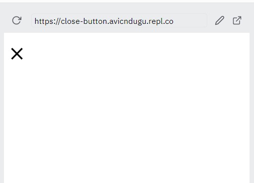
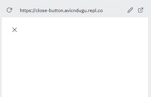
1. Close Button CSS 1: Times
You can make a close button using the times(×) symbol.
HTML Code
<span class="close">×</span>
CSS Code
.close {
  font-size: 45px;
  font-weight: 600;
}
Result
2. Close Button CSS 2: Plus
You can also create a close button using the plus(+) symbol.
You will need to rotate the plus sign so that it looks like a cancel button.
HTML Code
<div>
  <span class="close">+</span>
</div>
CSS Code
.close {
  font-size: 45px;
  font-weight: 600;
  display: inline-block;
  transform: rotate(45deg);
}
Result
3. Close Button CSS 3
You can also use an SVG image of a cancel button for your close button.
HTML
<div class="nav-cancel is-active" id="nav-cancel">
  <svg xmlns="http://www.w3.org/2000/svg" width="24" height="24" viewBox="0 0 24 24"><path d="M24 20.188l-8.315-8.209 8.2-8.282-3.697-3.697-8.212 8.318-8.31-8.203-3.666 3.666 8.321 8.24-8.206 8.313 3.666 3.666 8.237-8.318 8.285 8.203z"/></svg>
</div>
Result
4. Close Button CSS 4
You can also build a close button bulma style.
HTML
<a role="button" class="navbar-burger" aria-label="menu" aria-expanded="false">
  <span aria-hidden="true"></span>
  <span aria-hidden="true"></span>
  <span aria-hidden="true"></span>
</a>
CSS
.navbar-burger {
  cursor: pointer;
  display: block;
  height: 3.25rem;
  position: relative;
  width: 3.25rem;
}
.navbar-burger span {
  background-color: currentColor;
  display: block;
  height: 1px;
  left: calc(50% - 8px);
  position: absolute;
  transform-origin: center;
  transition-duration: 86ms;
  transition-property: background-color,opacity,transform;
  transition-timing-function: ease-out;
  width: 16px;
}
.navbar-burger span:nth-child(1) {
  top: calc(50% - 6px);
}
.navbar-burger span:nth-child(2) {
  top: calc(50% - 1px);
  display: none;
}
.navbar-burger span:nth-child(3) {
  top: calc(50% + 4px);
}
.navbar-burger span:nth-child(1) {
  transform: translateY(5px) rotate(45deg);
}
.navbar-burger span:nth-child(3) {
  transform: translateY(-5px) rotate(-45deg);
}
Result
5. Close Button CSS 5: Before and After
You can also create a close button using Pseudo elements in CSS.
HTML Code
<span class="close"></span>
CSS Code
.close {
  position: absolute;
  right: 32px;
  top: 32px;
  width: 32px;
  height: 32px;
  opacity: 0.7;
}
.close:hover {
  opacity: 1;
}
.close:before, .close:after {
  position: absolute;
  left: 15px;
  content: ' ';
  height: 33px;
  width: 2px;
  background-color: #333;
}
.close:before {
  transform: rotate(45deg);
}
.close:after {
  transform: rotate(-45deg);
}
Result
6. Bootstrap Close Button
You can also create a close button on your website using Bootstrap.
HTML Code
<button type="button" class="btn-close" aria-label="Close"></button>
Remember to import Bootstrap to your website before attempting to add the button.
Result