How to Create a Simple Responsive Navbar in HTML CSS
A simple navbar allows you to add links that are accessible throughout your whole website.
Adding a navigation bar to your HTML website might feel like a complicated task.
Instead, you can make it easier by creating a simple navbar.
You will need to start by adding the HTML code.
<nav class="nav">
      <a href="/" class="nav-link">Home</a>
      <a href="products.html" class="nav-link">Products</a>
      <a href="about.html" class="nav-link">About</a>
      <a href="tools.html" class="nav-link">Tools</a>
      <a href="blog.html" class="nav-link">Blog</a>
    </nav>
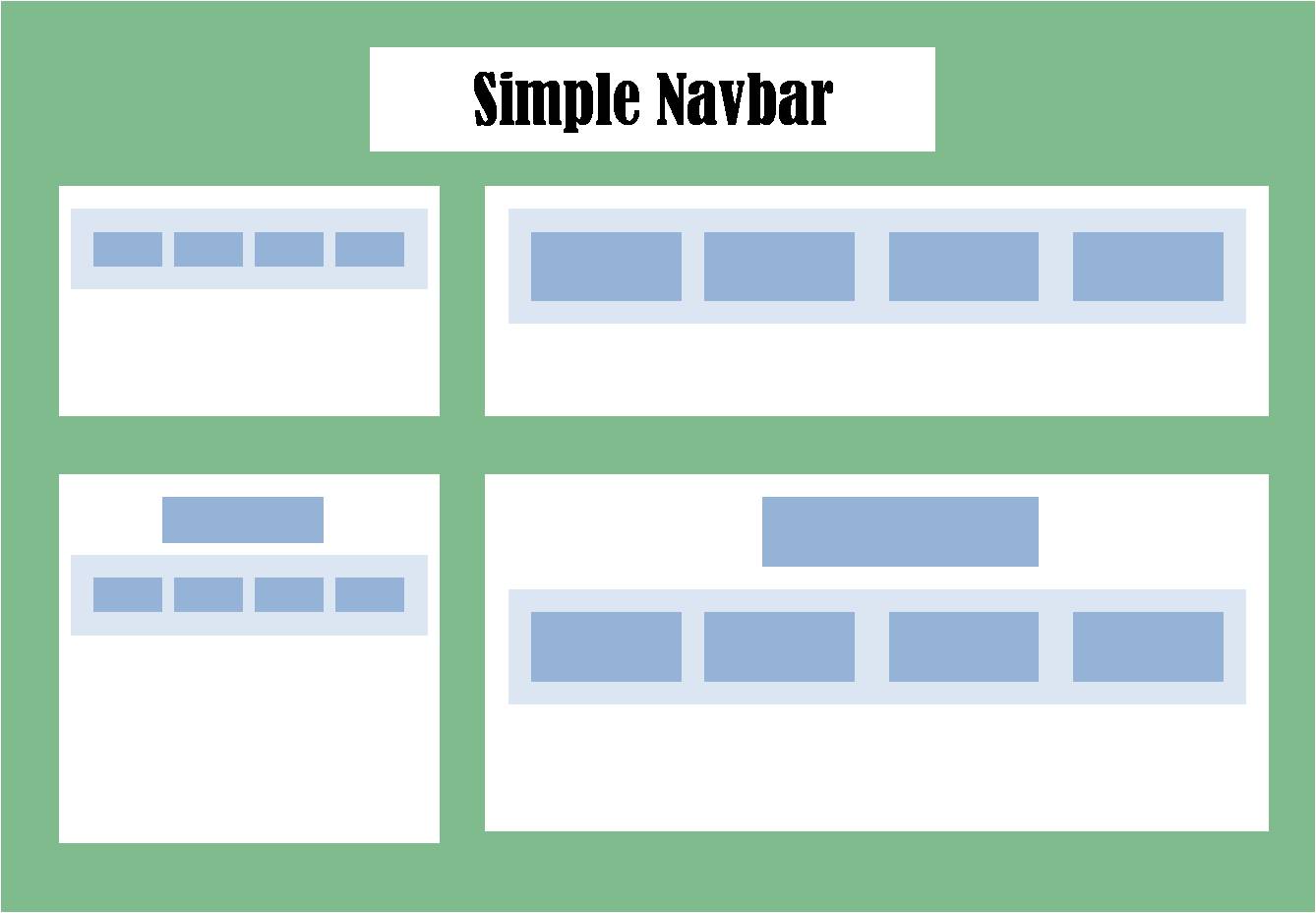
Here you have a nav container with four links. You can see they appear just like any unstyled HTML links. [image]
Style a Simple Navbar in CSS
First, you need to center the list of links.
Then, apply some space on both the left and right sides.
Finally, adjust the size of the link text.
.nav {
        text-align: center;
        background-color: #f1f3f5;
        padding: 10px 0px;
        font-size: 1rem;
      }
[image]
Conclusion
With a navbar added to your website, it’s time to add a simple footer to your website.
You can also create a navbar with a hamburger menu using HTML and CSS. On mobile devices, your navbar only appears when the reader clicks the menu icon.
