How to divide div into 3 equal columns layout CSS

Dividing a webpage into 3 columns creates more space to present content especially on desktop and wide screen.
3 columns Layout HTML CSS Code
HTML
<div class="columns">
  <div class="column">
    Column 1
  </div>
  <div class="column">
    Column 2
  </div>
  <div class="column">
    Column 3
  </div>
</div>
CSS
.column {
  float: left;
  width: 33.33%;
}

/* Stops the float property from affecting content after the columns */
.columns:after {
  content: "";
  display: table;
  clear: both;
}
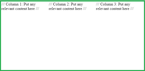
Results

To make it responsive, we are going to use media queries an mobile first approach
.column {
  width: 100%;
}
@media (min-width: 48em) {
  .column {
    float: left;
    width: 33.33%;
  }
  /* Stops the float property from affecting content after the columns */
  .columns:after {
    content: "";
    display: table;
    clear: both;
  }
}
For full width Layout
Just put them in a container and add some padding.
<div class="container">
  <div class=" columns">
    ///Put your individual columns inside here ///
  </div>
</div
CSS
.container {
   padding: 2em 4em;
}
Boxed Layout
For boxed Layout put the columns in a container with a maximum width.
HTML
<div class="container">
  <div class=" columns">
    ///Put your individual columns inside here ///
  </div>
</div>
CSS
.container {
  max-width: 1000px;
  margin-right: auto;
  margin-left:auto;
}
Result
3 Equal Columns Layout Website Examples
Example 1: Ethicalads Three columns
Example 2: Grammarly - Three columns
Example 3: Copy.ai - Three columns
[Screenshot with caption of with details like: boxed or full width] [Links: 1. For full length screenshot. 2. For link to website page]
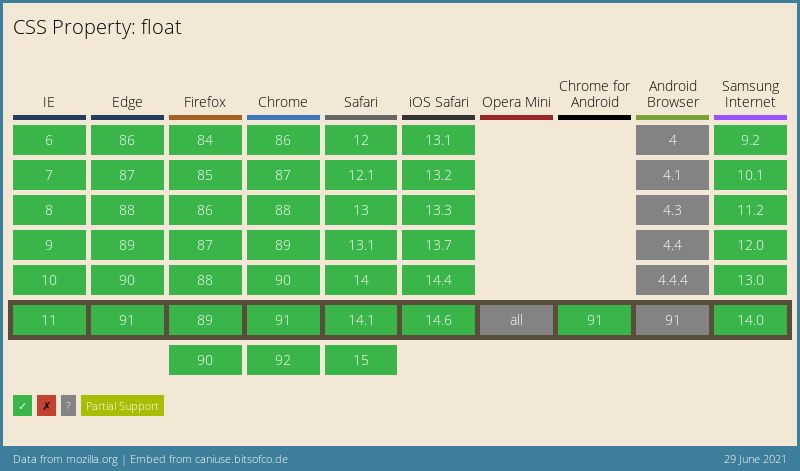
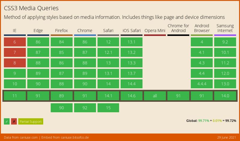
Browser support for 3 columns CSS Float and Media Queries
- Browser support for CSS Float

- Browser support for CSS Media queries


