10 Simple CSS Column Layouts to Build in 2021
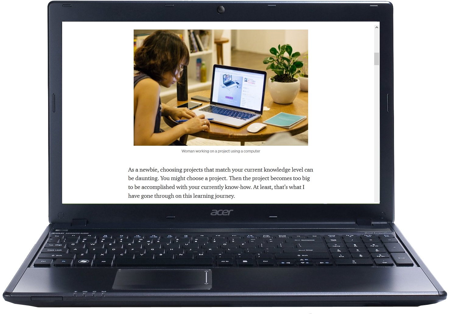
You can make elaborate layouts on websites without using CSS frameworks.
You can use CSS Grid and Flexbox to build your layouts. They are now widely supported by majority of the browsers.
Dive into some of the simple CSS layouts that you can create in 2021.
10 Simple CSS layouts in 2021
1. Single Column Centered Layout
 Using this method, you arrange the main content of the website in one column.
You want to keep the readers focused on the content, so ensure you have enough white space on both sides of the content.
Ideally, you can use a single-column centered layout for blogpost pages, landing pages, or other single focus webpages.
2. Single Column Full-Width Layout
You can use this layout if you want your website to span across the whole screen.
If you have attention-grabbing images, you can place them at the top of each page of your website. This image is called the featured image.
The full-width image pulls the attention of the reader to the website content.
3. Split Page Layout
You can use this layout when you have a website that serves two distinct customers personas.
Also, you can benefit from this layout if your brand has two distinct product offerings.
Your readers will appreciate the contrast between the two items or services and choose accordingly.
4. 2 Equal Columns Layout
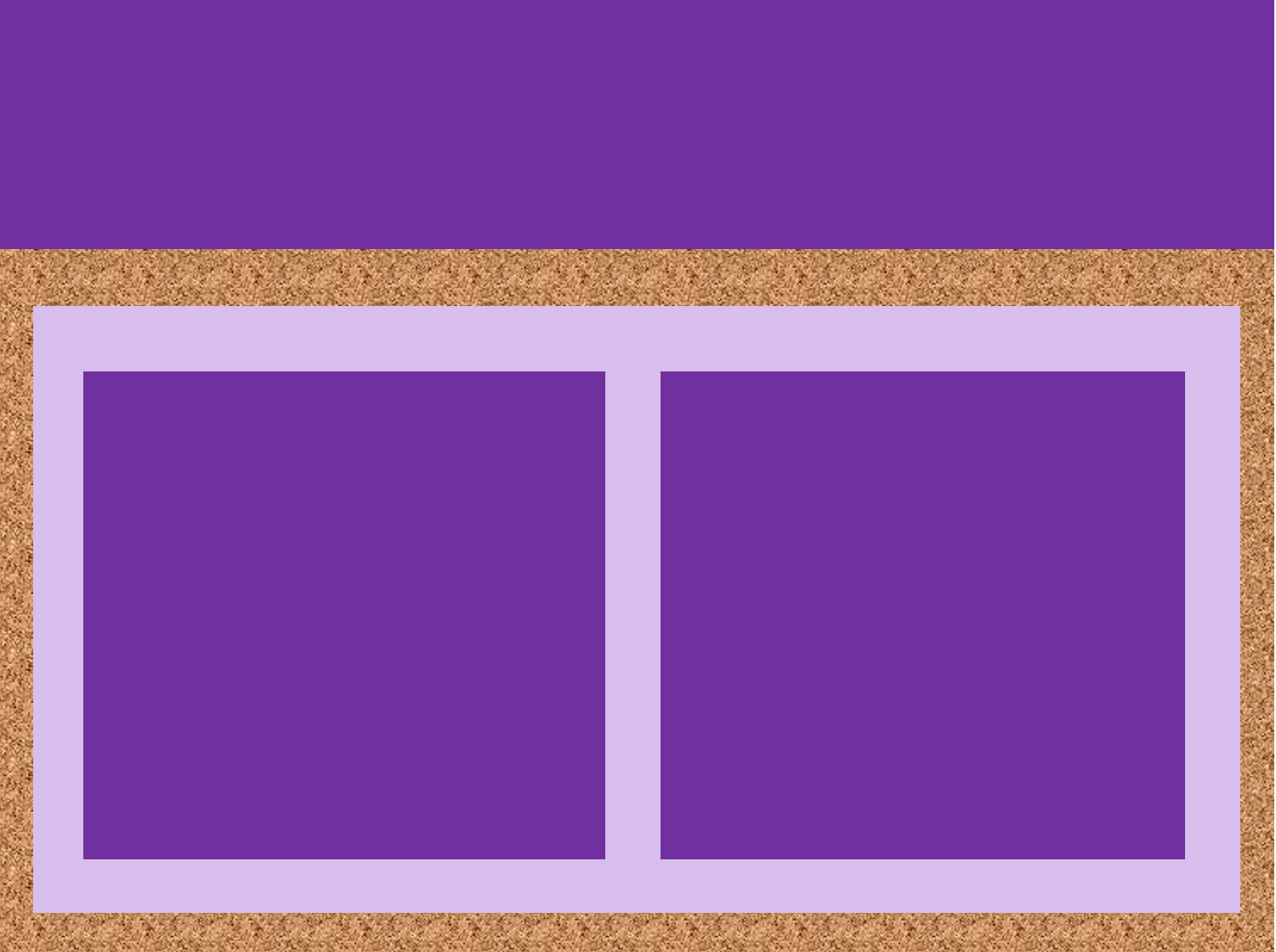 When you have two items of equal importance, you can use a two-column layout to display them.
You can use the layout to showcase features, pricing, testimonials, and projects.
5. Content – Navigation Bar Layout
Sometimes, you may want to position your navigation bar next to the content instead of the top. Using the content-navbar layout, you can put the navigation bar on the left or the right side of the content.
Your navbar only takes a small portion of the webpage while content occupies the rest of the space.
On mobile devices, your navigation bar switches to the top position while the content appears beneath it.
6. Content-Sidebar Layout
You have probably heard that the website sidebars are dead. I am here to tell you that the sidebar still works when used correctly.
Your sidebar website layout should be responsive.
On Desktop view, your main content section occupies two-thirds of the space. Your sidebar should utilize the remaining space.
On mobile view, your sidebar should move below the content, so everything appears as one column.
The sidebar layout is best when your website has lots of content covering a wide range of topics.
You can use the sidebar as a container for related articles, short about website descriptions, email subscription forms, ads, and important website links.
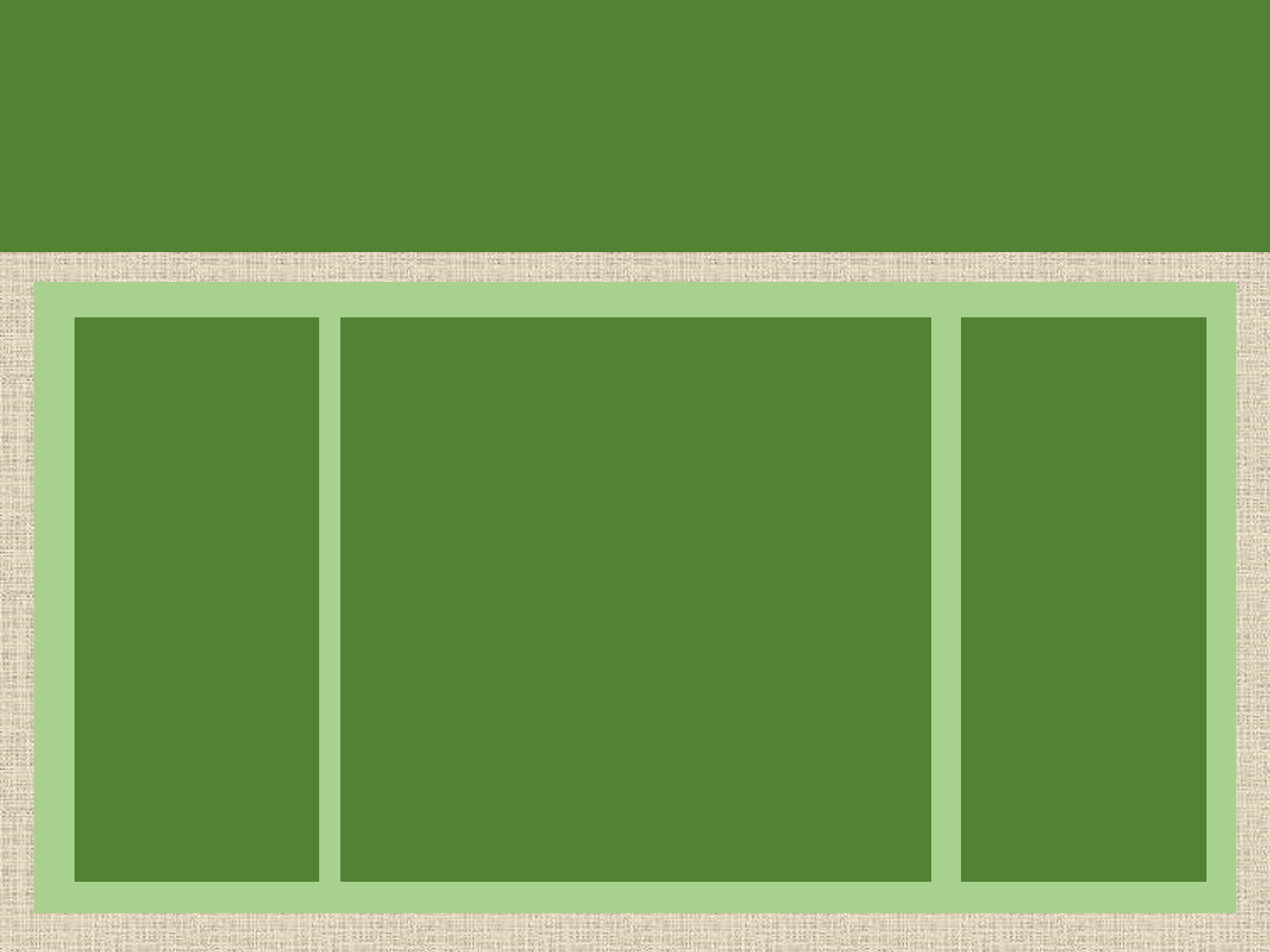
7. 3 Equal Columns Layout
You can use this layout when displaying three items of equal importance like benefits, features, cards.
8. Holy Grail Layout
Holy grail layout was a tricky layout to create if you were building websites some years ago. However, with flexbox and CSS grid, you can make this layout effortlessly.
It has a three-column layout: one middle content column and two sidebar columns.
You place the main navigation on the left, content in the middle, and page navigation on the right.
You can use this Holy grail layout on a documentation website.
9. 4 Equal Columns Layout
 If you have four items of equal importance, use the four-column layout. Use it to present footer links in a visually presentable manner.
10. 4 Unequal Columns Layout
If you want to emphasize one section of the footer, use the four unequal columns layout on your website.
You have one section occupying a third of the space. The remaining three columns share the remaining space equally.
11. 5 Unequal Columns Layout
Works for the magazine-style type of web pages. Content with higher importance is allocated more space compared to any other content. Thus, you can focus the reader’s attention in the right place.
Conclusion
As you can see, there is an abundance of layouts you can use to present website content using only HTML and CSS.
Which layout are you going to build in your next project?
