Main parts of a web page layout with examples
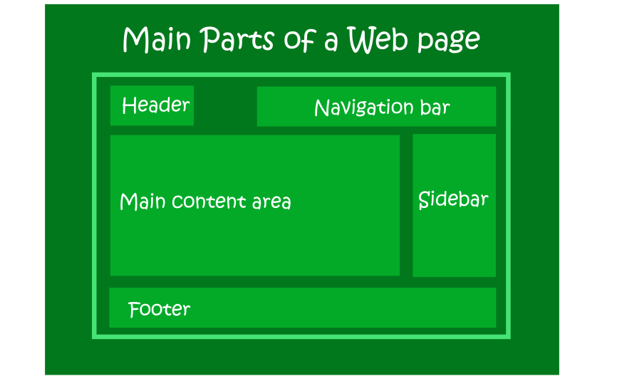
There are 5 main parts of any web page layout that you will encounter are. These are:
- headers
- navigation bars
- main content area
- sidebars
- footers
Most web pages will contain all the five parts. However, some web pages may omit some of the parts e.g. - a landing page or a sales page may omit the sidebar. - a one page website may omit the navigation bar. - a website may place the navigation bar where the sidebar is usually positioned.
Don’t worry if these terms sound like jargon for now. By the end of our time together, you will have a good understanding of each part of a website layout and its function.
5 main parts of a web page layout with their functions
 A web page layout is an important aspect of a website. A well planned layout enables the visitors to easily navigate and engage with a webpage. The following are the main important parts of majority of web pages layout:
-
Headers
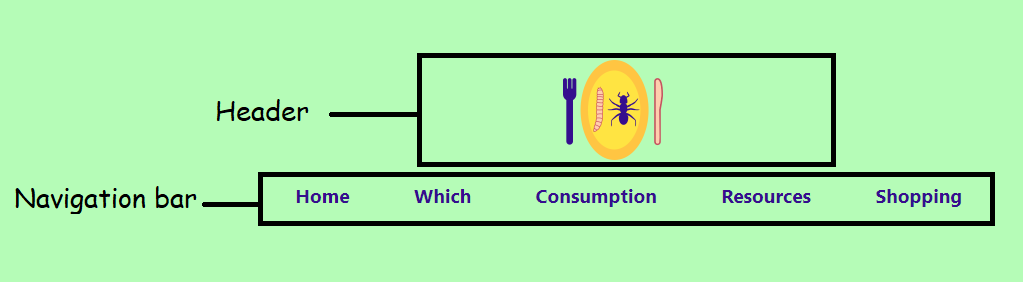
This is the top most part of a website that contains the logo or the name of the website. Your readers are able to tell if they have landed on your website due to the branding on the header.
-
Navigation bars or Menu bars
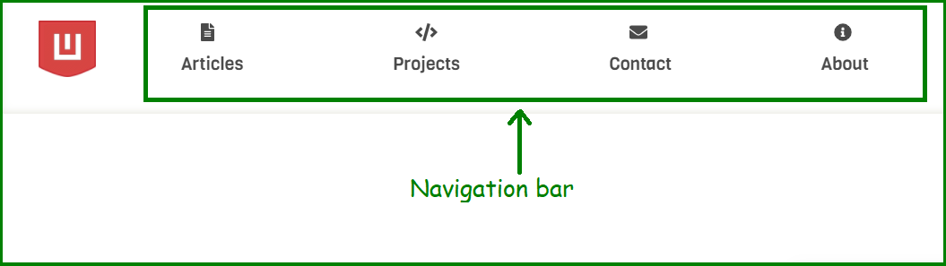
Your navigation bar appears at the top of every web page on your website right. It can appear next to the header or just below the header. Your menu bar helps your website visitors click to the different sections of your website i.e. navigate around your website.
On mobile devices, the navigation bar is usually collapsed to a hamburger menu( three lines). To access the menu items, you just click on the hamburger menu to access the links.
-
Main Content area
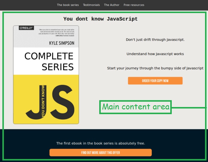
This is the unique information your visitors come to interact with. It usually has a title and then followed by the text, images, video content below it. You can place engaging content that will either enlighten, or entertain your web page visitors.
You must ensure that each web page you create deliver a unique message to the visitors who engage with it.
-
Sidebars
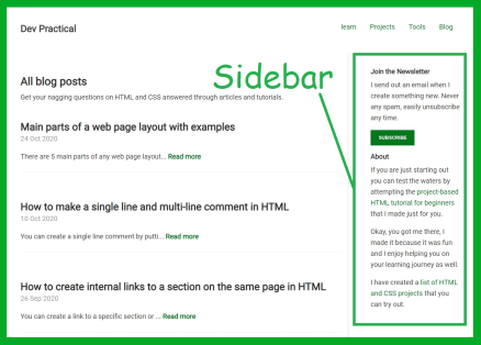
A sidebar is a section on a web page that appear next to the main content area. It usually occupy a narrower space than the main content area.
You can add a subscribe form, a search box, a product ad, or an about section on the sidebar that will appear on each web page on your website.
On mobile devices, the sidebar is moved from the right side of the website to the bottom, just below the main content area.
On special web pages like landing pages, sidebars are not present so that they don't distract the visitors from the message of the web page.
-
Footers

Your footer appears at the bottom of each web page on your website.Usually, it contain legal content and notices eg. copyright notice, privacy policy and affiliate disclaimers.
Your footer can also contain other important links like: about and contact links, social media icons links and donation button links.
What are the main parts of a mobile friendly website layout

Mobile friendly layout presents content in a single column consisting of header, navigation bar, main content area, and footer.
All the content is arranged in such a way that it apears in one column. This means that there are no sidebar in a mobile friendly layout.
If a sidebar happen to exist in the general layout, it is displayed below the main content area and above the footer on the mobile layout.
The sidebar is displayed at the top of the mobile page, if your website has navigation bar appearing where the sidebar is normally positioned on desktop.
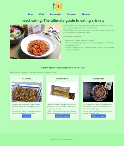
Parts of a Desktop web page layout examples
Parts of a Mobile web page layout examples
You can display content on mobile page layout as one single column.
The easiest way to do this is by moving the items that were placed side by side into one column. The other way you can do this is by hiding the items not on the main column. I prefer the first method since it allows the users to have access to all the content no matter the device they are using.
