Tailwind CSS Utility Classes: A Deep Dive
Tailwind CSS has taken the web development world by storm with its unique approach to styling. It’s all about utility classes, and in this deep dive, we’ll explore what they are, how they work, and why they’re a game-changer for web developers.
What Are Utility Classes?
Utility classes are small, single-purpose CSS classes that do one thing and do it well. Instead of writing custom CSS for every element on your website, you can apply these classes directly to your HTML tags. This approach speeds up development and keeps your codebase clean and maintainable.
The Anatomy of a Utility Class
Utility classes in Tailwind follow a simple naming convention. They consist of a prefix, property, and value. For example, bg-blue-500 sets the background color to a shade of blue. Let’s break it down:
-
Prefix: The prefix defines the category of the utility class. In this case, “bg” stands for “background.”
-
Property: The property specifies what aspect of the element you want to style. In our example, it’s the background color.
-
Value: The value indicates the specific styling you want to apply. In
bg-blue-500, “blue-500” corresponds to a shade of blue.
Using Utility Classes
Now that we understand the structure, let’s see how to use utility classes in your HTML:
<div class="bg-blue-500 text-white p-4">
  This is a blue box with white text and some padding.
</div>
Results
It’s as simple as adding the class attribute and specifying the utility classes you need. Tailwind will take care of the rest, applying the styles accordingly.
Responsive Design with Utility Classes
Tailwind CSS makes responsive design a breeze. You can apply classes for different screen sizes using breakpoints like sm, md, lg, and xl. For instance:
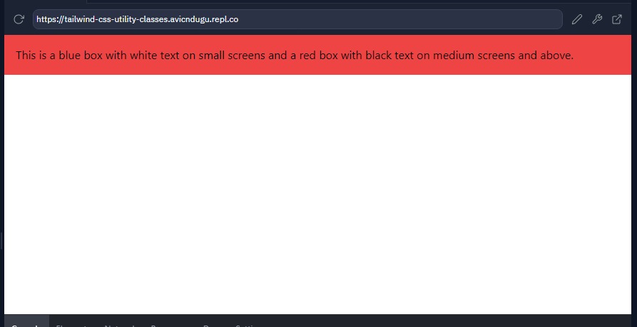
<div class="bg-blue-500 text-white p-4 md:bg-red-500 md:text-black">
  This is a blue box with white text on small screens and a red box with black text on medium screens and above.
</div>
Results
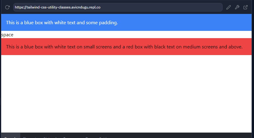
This flexibility allows you to create responsive layouts without writing custom media queries.
Pseudo-Classes
Tailwind CSS extends its capabilities with pseudo-classes. These let you add interactivity to your styles. For example:
- Hover: Use
hover:bg-gray-200to change styles when users hover over an element. - Focus: Apply styles when elements gain focus for accessibility, like
focus:outline-noneto customize focus outlines. - Active: Define styles for active interactions, such as
active:bg-blue-500for clicked buttons.
Customization
While Tailwind provides an extensive set of utility classes out of the box, you can easily customize them to match your project’s design system. The tailwind.config.js file allows you to add, modify, or remove utility classes, colors, fonts, and more.
Benefits of Tailwind CSS Utility Classes
Faster Development
With utility classes, you can prototype and build web pages quickly. No more writing CSS from scratch or searching through stylesheets for specific rules.
Readable HTML
Your HTML becomes more self-explanatory. Anyone looking at your code can understand the styles applied without digging into CSS files.
Consistent Design
Tailwind enforces a consistent design language across your project. No more accidental style variations.
Smaller CSS Footprint
Since Tailwind generates only the CSS you use, your stylesheet size stays small, improving site load times.
Drawbacks of Tailwind CSS Utility Classes
Learning Curve
Some beginners may find the extensive class list overwhelming.
Larger HTML Files
Utility classes can make HTML files larger and less readable.
